
CUSTOM DESIGN CASE STUDY

The Brief
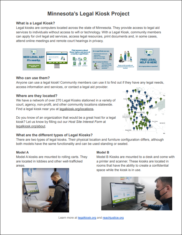
My client was an instructional designer who was asked to create a flier for the services of the MN Legal Kiosk Project. The agency wanted to make their clients aware of the services but did not want to use the one pager available on the project’s website. While it had a lot of great information, it was text heavy and not at all eye-catching.
They wanted the flier to look cohesive with the existing images but didn’t know if they liked the cartoon people that were used throughout the project’s site. They were given permission by the project to use their logo and colors to create a more marketing-like flier.
Visual Design
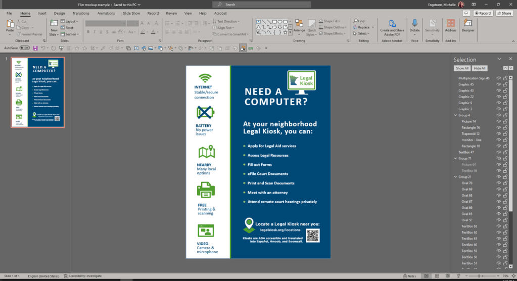
I worked with the instructional designer as my content SME and made a quick mockup using PowerPoint as we discussed. I like doing this because I can always zoom out and add sections or resize as we go. It was great for getting immediate responses on design ideation.
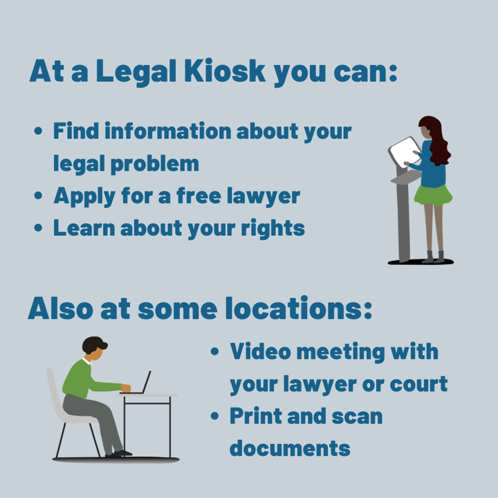
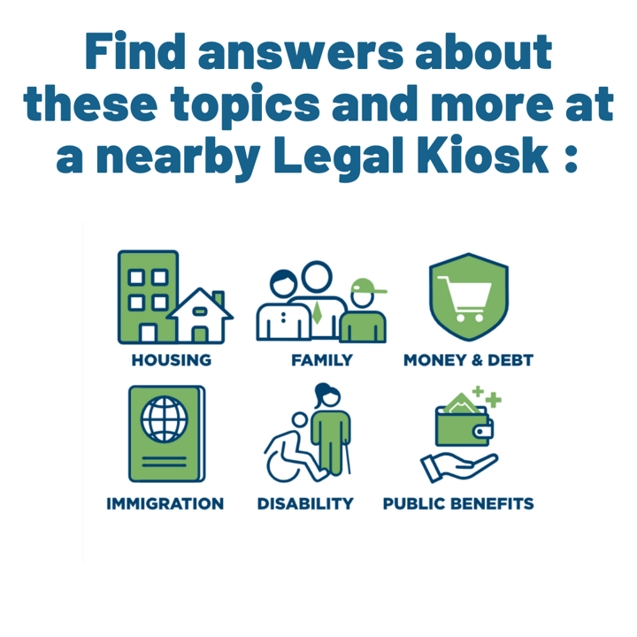
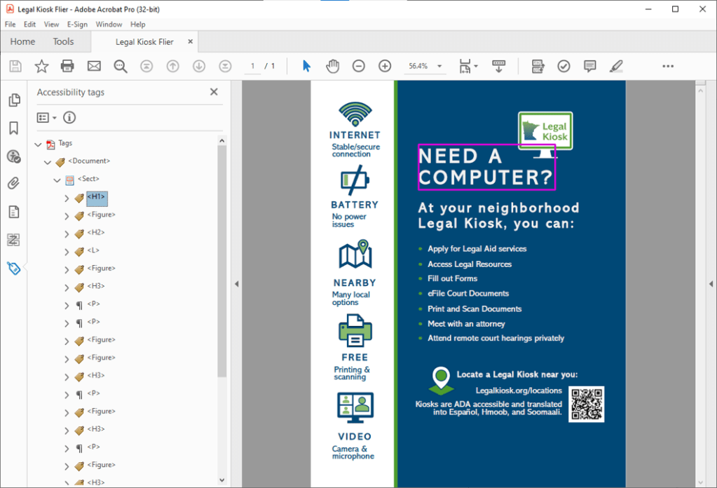
As the wording went through some changes, we focused in on how we wanted the design to look. I made some quick clip-art type designs, but the client wanted to look more “official.” So instead, I homed in on some of the icons used on the site’s Resources page. I asked if they would like me to create some custom icons to fit the branding/colors and we ultimately went that direction. I refined the icons, and the client loved the look. PowerPoint is a great tool for making scalable PNG images.
Accessible Design
As they wanted the document to be easily edited and accessible both printed and digitally, I jumped into Word and made the flier that way. I get the words on the page and format them with inclusive techniques. Many designers lay out documents with tables to control spacing. This makes for some heavy fixes in PDF to ensure accessibility, called remediation. I do all I can to create an accessible source document so that when edits are needed, the exported PDF will be easy to remediate to meet WCAG standards, per the law.
I run the accessibility checker in Word, but I know exactly what to look for in terms of rules that must be kept and what is just a suggestion. Example- I got a “Hard to Read Text Contrast” warning because Word only checks the font color against the Page color, not the shapes placed under the text.
When I’ve made the document as accessible as possible, I export it to Adobe PDF. I ran the accessibility checker and got 2 hits:
Color Contrast – Needs Manual Check
This automatically pulls up for every check. I already checked the colors to ensure it was meeting contrast standards to its background. Specifically, the blue to the white. I also checked the green to white to be extra sure, given the Legal Kiosk logo.

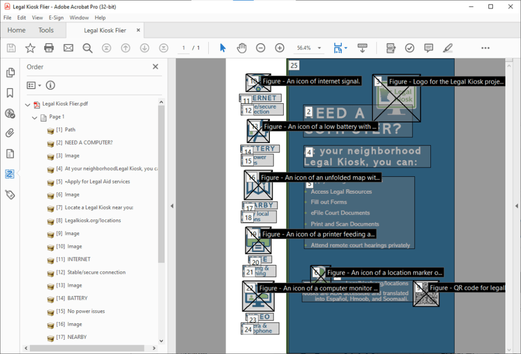
Logical Reading Order – Needs Manual Check
This automatically pulls up for every check. Some remediation was needed to ensure that images fell in the order they logically should to a sighted user. There was much discussion about whether or not the left panel with the benefits icons would be viewed first or not, and we decided to prioritize the body of the flier.
Beyond the Accessibility Checker
As discussed above, there was significant effort placed to change around the natural reading order because it was determined that body of the flyer was naturally read before the substantially skinnier “benefits panel” on the left of the page. This remediation will have to be done in PDF any time an edit is made.
Final was approved and I included a page about remediation if edits are made, but also offered to quickly remediate myself as ongoing support. Which has yet to be taken advantage of.
